


The Ultimate Guide to Responsive and Mobile-First Web Design

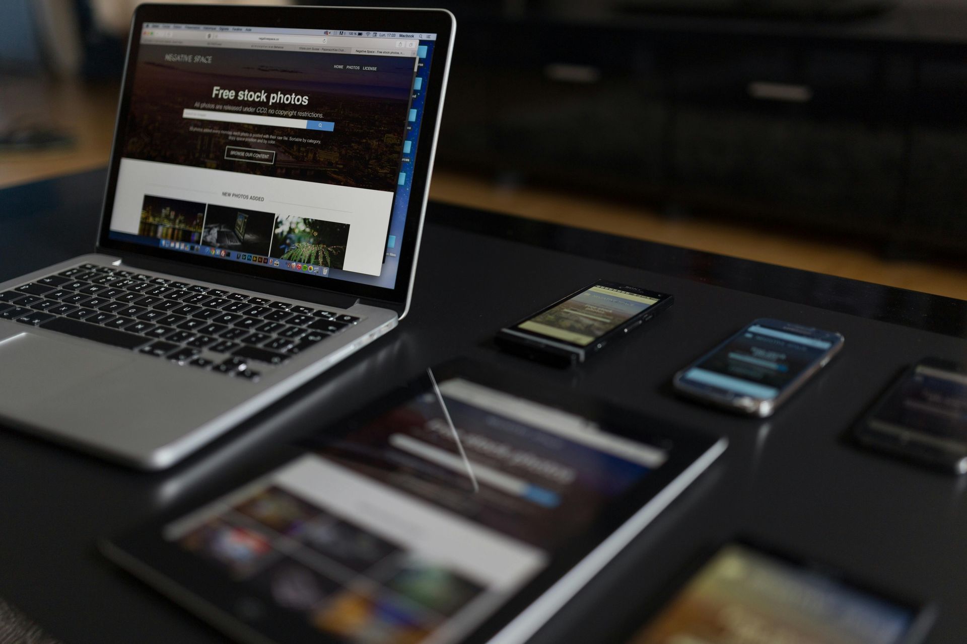
Today, your website is often the first impression people have of your brand — and that impression happens on all kinds of devices. From smartphones and tablets to laptops and desktops, users expect fast, beautiful, and seamless online experiences wherever they are.
That’s why responsive and mobile-first web design have become essential elements of modern website development.
What is Responsive Web Design?
Responsive web design is an approach that ensures a website adapts its layout and content automatically based on the user’s device and screen size. This flexibility means your website looks polished and functions smoothly whether someone is viewing it on a large desktop monitor or a tiny phone screen.
By using fluid grids, flexible images, and CSS media queries, responsive design eliminates the need for separate mobile and desktop versions of a site — saving time, money, and maintenance headaches.
What is Mobile-First Web Design?
Mobile-first design takes responsiveness a step further. Instead of designing a desktop site first and scaling it down for mobile, the mobile-first approach starts with the smallest screen and builds up from there.
Why does this matter? Because mobile users often face more limitations — smaller screens, slower internet speeds, and touch navigation. Designing for mobile-first ensures that your site is lightweight, intuitive, and focused on essential content — creating a better experience for everyone, even on desktop.
Benefits of Responsive & Mobile-First Web Design
→ Better User Experience
Users are more likely to stay, engage, and convert when your site works perfectly on their device.
→ Improved SEO Performance
Google prioritizes mobile-friendly websites in search rankings — responsive design is key for visibility.
→ Increased Conversion Rates
Mobile-first sites remove friction from the user journey, making actions like buying, booking, or contacting easier.
→ Future-Proofing Your Site
As new devices and screen sizes emerge, a responsive framework ensures your site stays functional and beautiful.
Best Practices for Responsive & Mobile-First Design
- Start your design with mobile wireframes
- Prioritize content — less is more
- Optimize images for fast load times
- Use flexible grids and layouts
- Make buttons large enough for touch interaction
- Test your site on real devices, not just emulators
- Keep navigation simple and accessible
- Focus on performance and speed
Ready to Create a Website That Works Everywhere?
At Digital Inspired, we don’t just build websites — we craft digital experiences that connect with users on every screen. Whether you’re launching a new brand, refreshing an outdated site, or looking to boost mobile performance, we’ll help you create a responsive, mobile-first website designed to perform.
It’s time to future-proof your online presence and deliver an experience your users will love.
→ Let’s talk about your project. Contact Digital Inspired today!